Accordion
Stacked disclosures: one panel at a time, animated on the shared clock.
Alert
The static callout: icon, title, description — it informs, never acts.
AlertDialog
The interruption that requires a decision — no backdrop dismissal.
Avatar
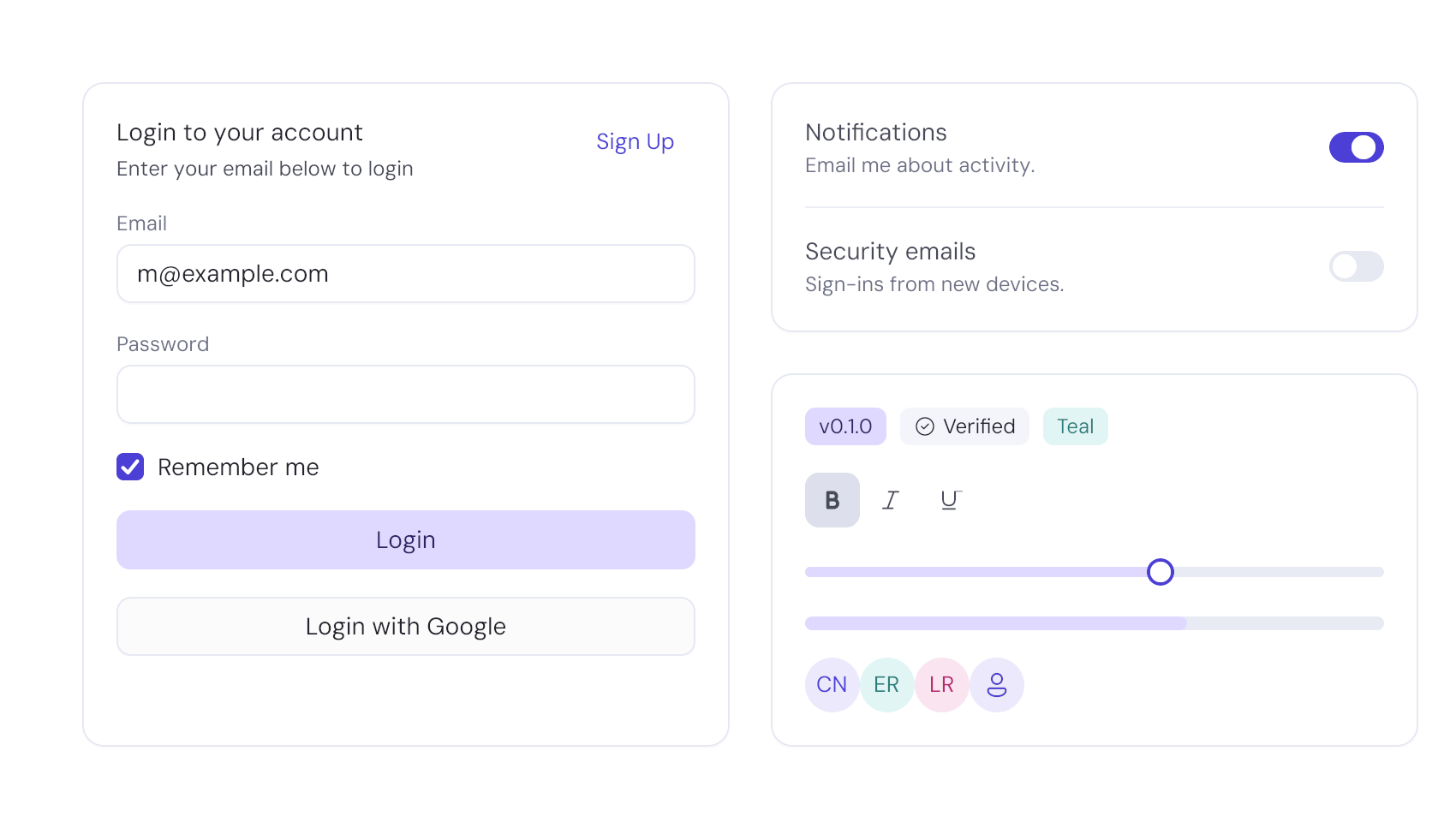
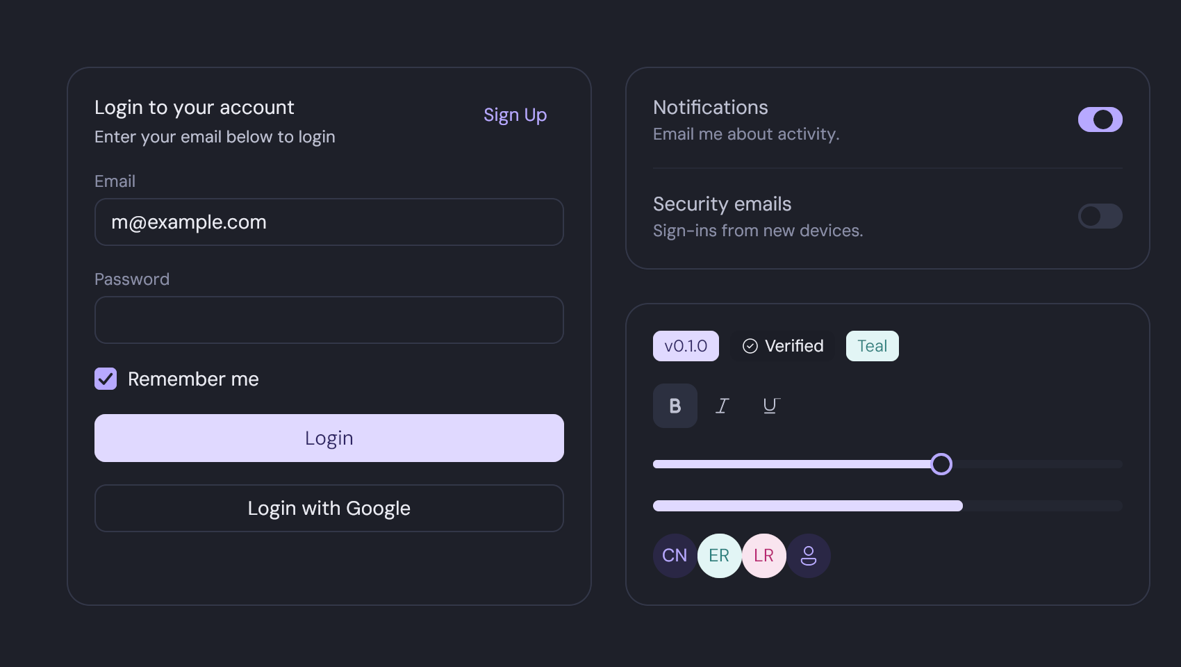
The circular identity mark: initials, a fallback glyph, any scale's tint.
Badge
Small rounded labels: four variants × seven sizes × any color.
Breadcrumb
The path to the current page: muted ancestors, chevrons, current in ink.
Button
Six variants × seven sizes × any color, options-driven.
ButtonGroup
Attached controls: one shared border, square inner corners.
Card
The grouping surface: three variants, size-scaled padding, everything else composed.
Checkbox
A themed box, a check, a label — plus indeterminate, invalid and sizes.
Dialog
The one overlay primitive: dimmed scrim, width-capped card, caller-owned visibility.
DropdownMenu
Labels, items, separators, checkboxes, radio groups — the full menu grammar.
Field
Label, helper, error and required — around any control.
Grid
The 2D layout primitive: equal tracks, items spanning columns and rows.
Input
The single-line input: three variants, seven sizes, composable everything else.
InputOTP
The one-time-code input: attached character slots, one hidden editor.
ListView
The virtualized list: 10,000 rows cost a screenful per frame.
Pagination
Previous, next, numbered pages — long ranges elide around the current one.
Popover
Arbitrary content on the floating layer, anchored to a trigger.
Progress
A determinate bar in the brand solid; negative value sweeps indeterminate.
RadioGroup
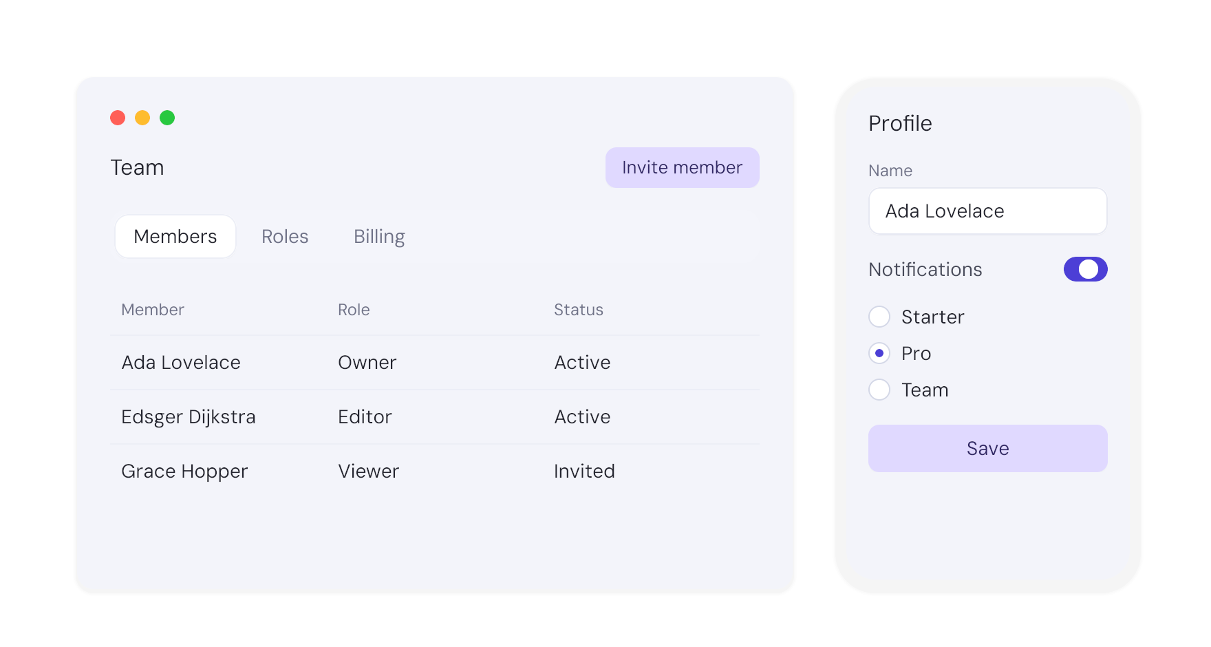
The exclusive choice: labeled circles, exactly one selected.
Select
Trigger + chevron, a floating panel of options, check-marked selection.
Separator
The semantic divider: a 1dp hairline, horizontal or vertical.
SimpleGrid
Responsive equal cells: give a minimum child width, get the right column count.
Skeleton
The loading placeholder: rounded blocks and circles pulsing on the shared clock.
Slider
The draggable value: track, brand fill, a ringed thumb.
Spinner
The standalone loading arc — Button's spinner, mountable anywhere.
Split
The carousel of panes — content is revealed and hidden, never reflowed.
Stack
VStack and HStack: children size themselves, the gap is the whole job.
Switch
The toggle: sliding thumb, accent when on, animated on the shared clock.
Table
Bounded tabular data: muted header, hairline rows, widget cells.
Tabs
Three variants and an explicit Update contract.
Textarea
The multi-line Input: same chrome, wrapping editor, minimum rows.
Toast
Transient notifications: bottom-right stack, auto-dismissing.
Toggle
The pressed-state button, and groups with single or multiple selection.
Tooltip
The hover label: inverted chrome, a rest delay, pass-through events.